> ## Documentation Index
> Fetch the complete documentation index at: https://wb-21fd5541-serverless-sft-revamp.mintlify.site/llms.txt
> Use this file to discover all available pages before exploring further.
# Scikit-Learn
wandb を使用すると、わずか数行の コード で scikit-learn モデル のパフォーマンスを可視化し、比較することができます。[例を試す →](https://wandb.me/scikit-colab)
## はじめに
### サインアップして APIキー を作成する
APIキー は、使用しているマシンを W\&B に対して認証します。ユーザープロファイルから APIキー を生成できます。
For a more streamlined approach, create an API key by going directly to [User Settings](https://wandb.ai/settings). Copy the newly created API key immediately and save it in a secure location such as a password manager.
1. 右上隅にあるユーザープロファイルアイコンをクリックします。
2. **User Settings** を選択し、**API Keys** セクションまでスクロールします。
### `wandb` ライブラリのインストールとログイン
ローカルに `wandb` ライブラリをインストールしてログインするには:
1. `WANDB_API_KEY` [環境変数](/models/track/environment-variables/) に APIキー を設定します。
```bash theme={null}
export WANDB_API_KEY=
```
2. `wandb` ライブラリをインストールしてログインします。
```shell theme={null}
pip install wandb
wandb login
```
```bash theme={null}
pip install wandb
```
```python theme={null}
import wandb
wandb.login()
```
```notebook theme={null}
!pip install wandb
import wandb
wandb.login()
```
### メトリクス の ログ 記録
```python theme={null}
import wandb
wandb.init(project="visualize-sklearn") as run:
y_pred = clf.predict(X_test)
accuracy = sklearn.metrics.accuracy_score(y_true, y_pred)
# 時系列でメトリクスをログ記録する場合は run.log を使用します
run.log({"accuracy": accuracy})
# または、トレーニングの最後に最終的なメトリクスをログ記録する場合は run.summary も使用できます
run.summary["accuracy"] = accuracy
```
### プロットの作成
#### ステップ 1: wandb のインポートと新しい Run の初期化
```python theme={null}
import wandb
run = wandb.init(project="visualize-sklearn")
```
#### ステップ 2: プロットの可視化
#### 個別のプロット
モデル の トレーニング と 予測 の完了後、wandb でプロットを生成して 予測 を分析できます。サポートされているチャートの全リストについては、以下の **サポートされているプロット** セクションを参照してください。
```python theme={null}
# 単一のプロットを可視化
wandb.sklearn.plot_confusion_matrix(y_true, y_pred, labels)
```
#### すべてのプロット
W\&B には、関連する複数のプロットを一度に描画する `plot_classifier` などの関数があります。
```python theme={null}
# すべての分類プロットを可視化
wandb.sklearn.plot_classifier(
clf,
X_train,
X_test,
y_train,
y_test,
y_pred,
y_probas,
labels,
model_name="SVC",
feature_names=None,
)
# すべての回帰プロット
wandb.sklearn.plot_regressor(reg, X_train, X_test, y_train, y_test, model_name="Ridge")
# すべてのクラスタープロット
wandb.sklearn.plot_clusterer(
kmeans, X_train, cluster_labels, labels=None, model_name="KMeans"
)
run.finish()
```
#### 既存の Matplotlib プロット
Matplotlib で作成されたプロットも W\&B ダッシュボード に ログ 記録できます。そのためには、まず `plotly` をインストールする必要があります。
```bash theme={null}
pip install plotly
```
最後に、以下のようにプロットを W\&B の ダッシュボード に ログ 記録できます。
```python theme={null}
import matplotlib.pyplot as plt
import wandb
with wandb.init(project="visualize-sklearn") as run:
# ここで plt.plot() や plt.scatter() などをすべて行います
# ...
# plt.show() の代わりに以下を実行します:
run.log({"plot": plt})
```
## サポートされているプロット
### 学習曲線 (Learning curve)
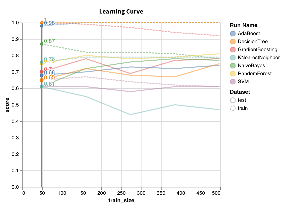 さまざまな長さの データセット で モデル を トレーニング し、トレーニングセット と テストセット の両方について、クロスバリデーションスコア対 データセット サイズのプロットを生成します。
`wandb.sklearn.plot_learning_curve(model, X, y)`
* model (clf または reg): フィット済みの回帰器または分類器を指定します。
* X (arr): データセット の特徴量。
* y (arr): データセット のラベル。
### ROC
さまざまな長さの データセット で モデル を トレーニング し、トレーニングセット と テストセット の両方について、クロスバリデーションスコア対 データセット サイズのプロットを生成します。
`wandb.sklearn.plot_learning_curve(model, X, y)`
* model (clf または reg): フィット済みの回帰器または分類器を指定します。
* X (arr): データセット の特徴量。
* y (arr): データセット のラベル。
### ROC
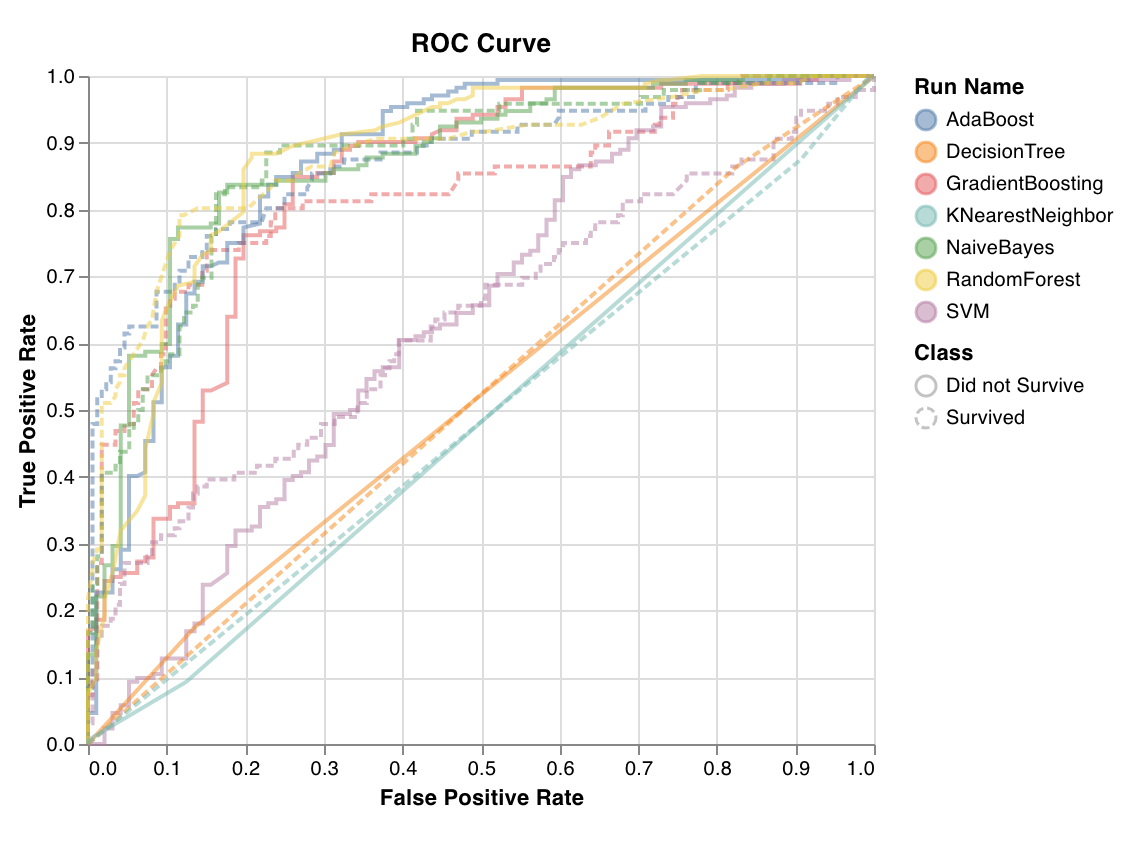 ROC曲線は、真陽性率 (y軸) 対 偽陽性率 (x-axis) をプロットします。理想的なスコアは、左上の点である TPR = 1 かつ FPR = 0 です。通常、ROC曲線下の面積 (AUC-ROC) を計算し、AUC-ROC が大きいほど優れた結果となります。
`wandb.sklearn.plot_roc(y_true, y_probas, labels)`
* y\_true (arr): テストセット のラベル。
* y\_probas (arr): テストセット の 予測 確率。
* labels (list): ターゲット変数 (y) の名前付きラベル。
### クラス比率 (Class proportions)
ROC曲線は、真陽性率 (y軸) 対 偽陽性率 (x-axis) をプロットします。理想的なスコアは、左上の点である TPR = 1 かつ FPR = 0 です。通常、ROC曲線下の面積 (AUC-ROC) を計算し、AUC-ROC が大きいほど優れた結果となります。
`wandb.sklearn.plot_roc(y_true, y_probas, labels)`
* y\_true (arr): テストセット のラベル。
* y\_probas (arr): テストセット の 予測 確率。
* labels (list): ターゲット変数 (y) の名前付きラベル。
### クラス比率 (Class proportions)
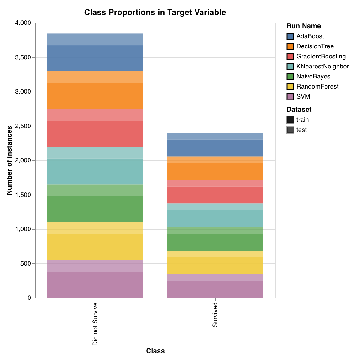 トレーニングセット と テストセット におけるターゲットクラスの分布をプロットします。不均衡なクラスを検出し、特定のクラスが モデル に不釣り合いな影響を与えていないか確認するのに役立ちます。
`wandb.sklearn.plot_class_proportions(y_train, y_test, ['dog', 'cat', 'owl'])`
* y\_train (arr): トレーニングセット のラベル。
* y\_test (arr): テストセット のラベル。
* labels (list): ターゲット変数 (y) の名前付きラベル。
### PR曲線 (Precision recall curve)
トレーニングセット と テストセット におけるターゲットクラスの分布をプロットします。不均衡なクラスを検出し、特定のクラスが モデル に不釣り合いな影響を与えていないか確認するのに役立ちます。
`wandb.sklearn.plot_class_proportions(y_train, y_test, ['dog', 'cat', 'owl'])`
* y\_train (arr): トレーニングセット のラベル。
* y\_test (arr): テストセット のラベル。
* labels (list): ターゲット変数 (y) の名前付きラベル。
### PR曲線 (Precision recall curve)
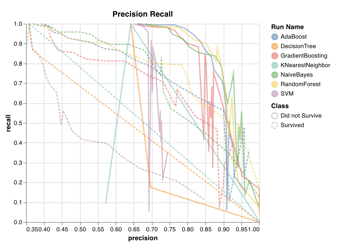 異なる閾値における 精度 (precision) と 再現率 (recall) のトレードオフを計算します。曲線下の面積が大きいことは、高い再現率と高い精度の両方を表します。高い精度は低い偽陽性率に関連し、高い再現率は低い偽陰性率に関連します。
両方のスコアが高いことは、分類器が正確な 結果 を返しており (高精度)、かつ全陽性 結果 の大部分を返している (高再現率) ことを示します。PR曲線 はクラスが非常に不均衡な場合に有用です。
`wandb.sklearn.plot_precision_recall(y_true, y_probas, labels)`
* y\_true (arr): テストセット のラベル。
* y\_probas (arr): テストセット の 予測 確率。
* labels (list): ターゲット変数 (y) の名前付きラベル。
### 特徴量重要度 (Feature importances)
異なる閾値における 精度 (precision) と 再現率 (recall) のトレードオフを計算します。曲線下の面積が大きいことは、高い再現率と高い精度の両方を表します。高い精度は低い偽陽性率に関連し、高い再現率は低い偽陰性率に関連します。
両方のスコアが高いことは、分類器が正確な 結果 を返しており (高精度)、かつ全陽性 結果 の大部分を返している (高再現率) ことを示します。PR曲線 はクラスが非常に不均衡な場合に有用です。
`wandb.sklearn.plot_precision_recall(y_true, y_probas, labels)`
* y\_true (arr): テストセット のラベル。
* y\_probas (arr): テストセット の 予測 確率。
* labels (list): ターゲット変数 (y) の名前付きラベル。
### 特徴量重要度 (Feature importances)
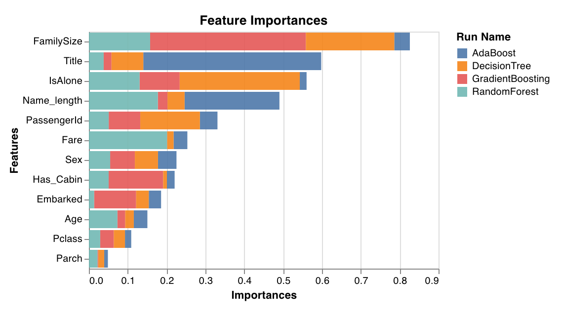 分類タスクにおける各特徴量の重要度を評価し、プロットします。ツリー のように `feature_importances_` 属性を持つ分類器でのみ機能します。
`wandb.sklearn.plot_feature_importances(model, ['width', 'height, 'length'])`
* model (clf): フィット済みの分類器を指定します。
* feature\_names (list): 特徴量の名前。特徴量のインデックスを対応する名前に置き換えることで、プロットを読みやすくします。
### 検証曲線 (Calibration curve)
分類タスクにおける各特徴量の重要度を評価し、プロットします。ツリー のように `feature_importances_` 属性を持つ分類器でのみ機能します。
`wandb.sklearn.plot_feature_importances(model, ['width', 'height, 'length'])`
* model (clf): フィット済みの分類器を指定します。
* feature\_names (list): 特徴量の名前。特徴量のインデックスを対応する名前に置き換えることで、プロットを読みやすくします。
### 検証曲線 (Calibration curve)
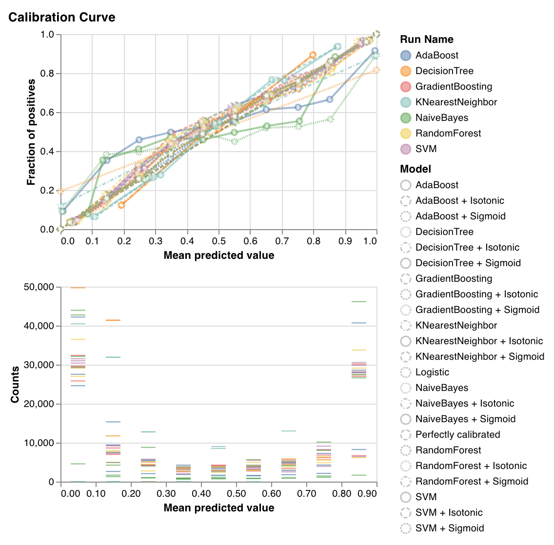 分類器の 予測 確率がどの程度適切に校正されているか、および校正されていない分類器をどのように校正するかをプロットします。ベースライン のロジスティック回帰 モデル 、引数 として渡された モデル 、およびその 等張校正 (isotonic calibration) と シグモイド校正 (sigmoid calibration) の両方による推定 予測 確率を比較します。
検証曲線が対角線に近いほど良好です。転置されたシグモイドのような曲線は過学習した分類器を表し、シグモイドのような曲線は 学習不足 (underfitting) の分類器を表します。 モデル の等張校正とシグモイド校正を トレーニング してそれらの曲線を比較することで、 モデル が過学習または 学習不足 であるかどうか、そしてその場合、どちらの校正 (シグモイドまたは等張) がその修正に役立つかを判断できます。
詳細については、[sklearn のドキュメント](https://scikit-learn.org/stable/auto_examples/calibration/plot_calibration_curve.html) を参照してください。
`wandb.sklearn.plot_calibration_curve(clf, X, y, 'RandomForestClassifier')`
* model (clf): フィット済みの分類器を指定します。
* X (arr): トレーニングセット の特徴量。
* y (arr): トレーニングセット のラベル。
* model\_name (str): モデル 名。デフォルトは 'Classifier' です。
### 混同行列 (Confusion matrix)
分類器の 予測 確率がどの程度適切に校正されているか、および校正されていない分類器をどのように校正するかをプロットします。ベースライン のロジスティック回帰 モデル 、引数 として渡された モデル 、およびその 等張校正 (isotonic calibration) と シグモイド校正 (sigmoid calibration) の両方による推定 予測 確率を比較します。
検証曲線が対角線に近いほど良好です。転置されたシグモイドのような曲線は過学習した分類器を表し、シグモイドのような曲線は 学習不足 (underfitting) の分類器を表します。 モデル の等張校正とシグモイド校正を トレーニング してそれらの曲線を比較することで、 モデル が過学習または 学習不足 であるかどうか、そしてその場合、どちらの校正 (シグモイドまたは等張) がその修正に役立つかを判断できます。
詳細については、[sklearn のドキュメント](https://scikit-learn.org/stable/auto_examples/calibration/plot_calibration_curve.html) を参照してください。
`wandb.sklearn.plot_calibration_curve(clf, X, y, 'RandomForestClassifier')`
* model (clf): フィット済みの分類器を指定します。
* X (arr): トレーニングセット の特徴量。
* y (arr): トレーニングセット のラベル。
* model\_name (str): モデル 名。デフォルトは 'Classifier' です。
### 混同行列 (Confusion matrix)
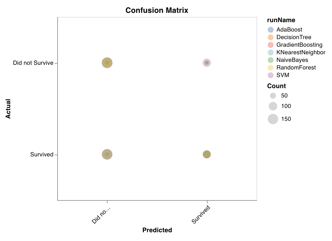 分類の正確さを評価するために混同行列を計算します。 モデル の 予測 の質を評価し、 モデル が間違えた 予測 のパターンを見つけるのに役立ちます。対角線は、実際のラベルと 予測 されたラベルが一致している、 モデル が正解した 予測 を表します。
`wandb.sklearn.plot_confusion_matrix(y_true, y_pred, labels)`
* y\_true (arr): テストセット のラベル。
* y\_pred (arr): テストセット の 予測 ラベル。
* labels (list): ターゲット変数 (y) の名前付きラベル。
### サマリーメトリクス (Summary metrics)
分類の正確さを評価するために混同行列を計算します。 モデル の 予測 の質を評価し、 モデル が間違えた 予測 のパターンを見つけるのに役立ちます。対角線は、実際のラベルと 予測 されたラベルが一致している、 モデル が正解した 予測 を表します。
`wandb.sklearn.plot_confusion_matrix(y_true, y_pred, labels)`
* y\_true (arr): テストセット のラベル。
* y\_pred (arr): テストセット の 予測 ラベル。
* labels (list): ターゲット変数 (y) の名前付きラベル。
### サマリーメトリクス (Summary metrics)
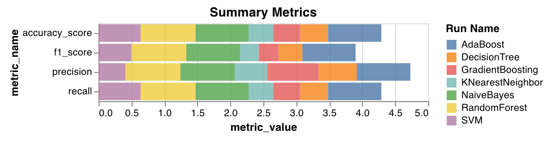 * 分類については、`mse`、`mae`、`r2` スコアなどのサマリー メトリクス を計算します。
* 回帰については、`f1`、正確度 (accuracy)、精度 (precision)、再現率 (recall) などのサマリー メトリクス を計算します。
`wandb.sklearn.plot_summary_metrics(model, X_train, y_train, X_test, y_test)`
* model (clf または reg): フィット済みの回帰器または分類器を指定します。
* X (arr): トレーニングセット の特徴量。
* y (arr): トレーニングセット のラベル。
* X\_test (arr): テストセット の特徴量。
* y\_test (arr): テストセット のラベル。
### エルボー図 (Elbow plot)
* 分類については、`mse`、`mae`、`r2` スコアなどのサマリー メトリクス を計算します。
* 回帰については、`f1`、正確度 (accuracy)、精度 (precision)、再現率 (recall) などのサマリー メトリクス を計算します。
`wandb.sklearn.plot_summary_metrics(model, X_train, y_train, X_test, y_test)`
* model (clf または reg): フィット済みの回帰器または分類器を指定します。
* X (arr): トレーニングセット の特徴量。
* y (arr): トレーニングセット のラベル。
* X\_test (arr): テストセット の特徴量。
* y\_test (arr): テストセット のラベル。
### エルボー図 (Elbow plot)
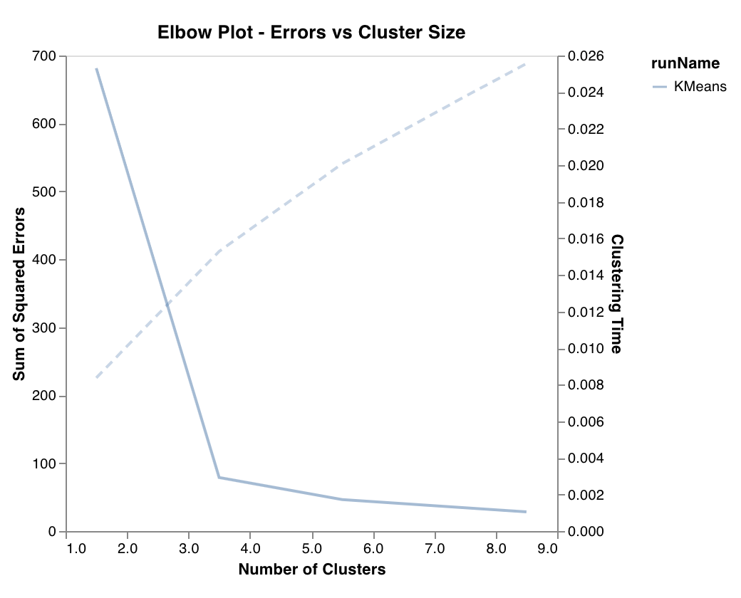 クラスター の数の関数として説明される分散の割合を、 トレーニング 時間とともに測定しプロットします。最適な クラスター 数を選択するのに役立ちます。
`wandb.sklearn.plot_elbow_curve(model, X_train)`
* model (clusterer): フィット済みの クラスター 器を指定します。
* X (arr): トレーニングセット の特徴量。
### シルエット図 (Silhouette plot)
クラスター の数の関数として説明される分散の割合を、 トレーニング 時間とともに測定しプロットします。最適な クラスター 数を選択するのに役立ちます。
`wandb.sklearn.plot_elbow_curve(model, X_train)`
* model (clusterer): フィット済みの クラスター 器を指定します。
* X (arr): トレーニングセット の特徴量。
### シルエット図 (Silhouette plot)
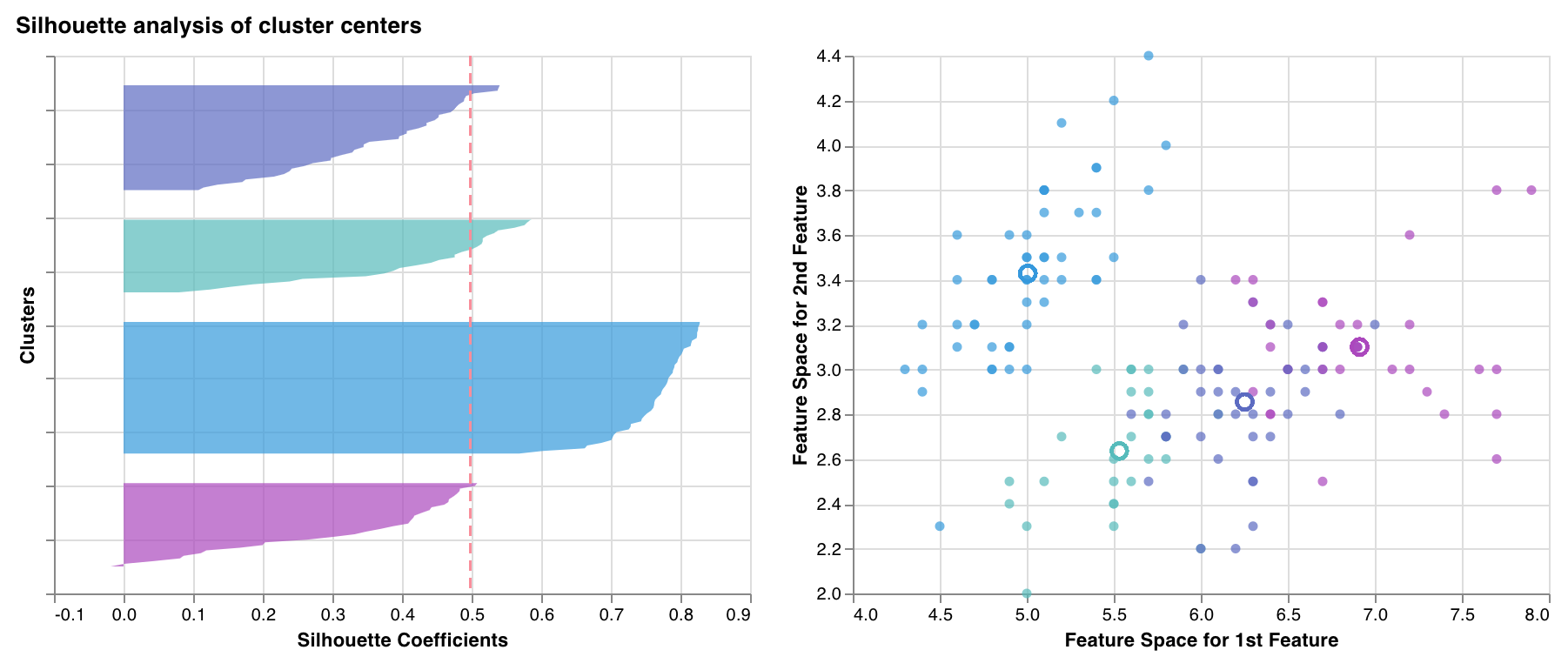 ある クラスター 内の各点が、隣接する クラスター 内の点とどの程度近いかを測定しプロットします。 クラスター の厚さは クラスター サイズに対応します。垂直線は、すべての点の平均シルエットスコアを表します。
シルエット係数が +1 に近い場合は、サンプルが隣接する クラスター から遠く離れていることを示します。 値 が 0 の場合は、サンプルが 2 つの隣接する クラスター 間の決定境界上または非常に近い場所にあることを示し、負の 値 はそれらのサンプルが誤った クラスター に割り当てられた可能性があることを示します。
一般的に、すべてのシルエット クラスター スコアが平均以上 (赤線を超える) で、できるだけ 1 に近いことが望ましいです。また、 データ 内の潜在的なパターンを反映した クラスター サイズが好まれます。
`wandb.sklearn.plot_silhouette(model, X_train, ['spam', 'not spam'])`
* model (clusterer): フィット済みの クラスター 器を指定します。
* X (arr): トレーニングセット の特徴量。
* cluster\_labels (list): クラスター ラベルの名前。 クラスター インデックスを対応する名前に置き換えることで、プロットを読みやすくします。
### 外れ値候補プロット (Outlier candidates plot)
ある クラスター 内の各点が、隣接する クラスター 内の点とどの程度近いかを測定しプロットします。 クラスター の厚さは クラスター サイズに対応します。垂直線は、すべての点の平均シルエットスコアを表します。
シルエット係数が +1 に近い場合は、サンプルが隣接する クラスター から遠く離れていることを示します。 値 が 0 の場合は、サンプルが 2 つの隣接する クラスター 間の決定境界上または非常に近い場所にあることを示し、負の 値 はそれらのサンプルが誤った クラスター に割り当てられた可能性があることを示します。
一般的に、すべてのシルエット クラスター スコアが平均以上 (赤線を超える) で、できるだけ 1 に近いことが望ましいです。また、 データ 内の潜在的なパターンを反映した クラスター サイズが好まれます。
`wandb.sklearn.plot_silhouette(model, X_train, ['spam', 'not spam'])`
* model (clusterer): フィット済みの クラスター 器を指定します。
* X (arr): トレーニングセット の特徴量。
* cluster\_labels (list): クラスター ラベルの名前。 クラスター インデックスを対応する名前に置き換えることで、プロットを読みやすくします。
### 外れ値候補プロット (Outlier candidates plot)
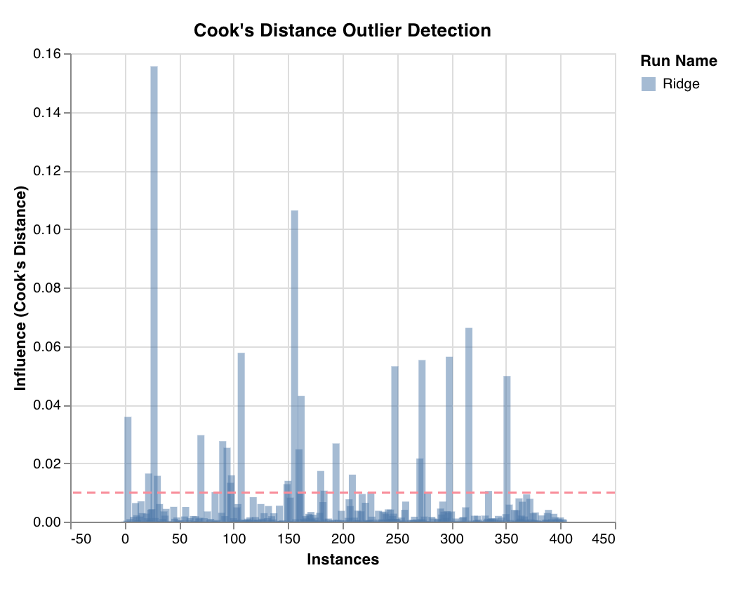 クックの距離 (Cook's distance) を通じて、回帰 モデル に対する データ ポイントの影響度を測定します。影響度が大きく偏っているインスタンスは、外れ値である可能性があります。外れ値検出に役立ちます。
`wandb.sklearn.plot_outlier_candidates(model, X, y)`
* model (regressor): フィット済みの分類器を指定します。
* X (arr): トレーニングセット の特徴量。
* y (arr): トレーニングセット のラベル。
### 残差プロット (Residuals plot)
クックの距離 (Cook's distance) を通じて、回帰 モデル に対する データ ポイントの影響度を測定します。影響度が大きく偏っているインスタンスは、外れ値である可能性があります。外れ値検出に役立ちます。
`wandb.sklearn.plot_outlier_candidates(model, X, y)`
* model (regressor): フィット済みの分類器を指定します。
* X (arr): トレーニングセット の特徴量。
* y (arr): トレーニングセット のラベル。
### 残差プロット (Residuals plot)
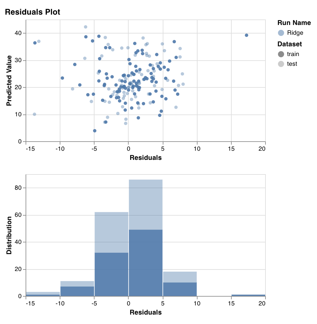 予測 されたターゲット 値 (y軸) 対 実際のターゲット 値 と 予測 されたターゲット 値 の差 (x軸)、および残差誤差の分布を測定しプロットします。
一般的に、適合精度の高い モデル の残差はランダムに分布するはずです。なぜなら、優れた モデル はランダムな誤差を除いて、 データセット 内のほとんどの現象を説明できるからです。
`wandb.sklearn.plot_residuals(model, X, y)`
* model (regressor): フィット済みの分類器を指定します。
* X (arr): トレーニングセット の特徴量。
* y (arr): トレーニングセット のラベル。
ご質問がある場合は、[Slack コミュニティ](https://wandb.me/slack) でぜひお尋ねください。
## 例
* [Colab で実行](https://wandb.me/scikit-colab): すぐに始められるシンプルな ノートブック です。
予測 されたターゲット 値 (y軸) 対 実際のターゲット 値 と 予測 されたターゲット 値 の差 (x軸)、および残差誤差の分布を測定しプロットします。
一般的に、適合精度の高い モデル の残差はランダムに分布するはずです。なぜなら、優れた モデル はランダムな誤差を除いて、 データセット 内のほとんどの現象を説明できるからです。
`wandb.sklearn.plot_residuals(model, X, y)`
* model (regressor): フィット済みの分類器を指定します。
* X (arr): トレーニングセット の特徴量。
* y (arr): トレーニングセット のラベル。
ご質問がある場合は、[Slack コミュニティ](https://wandb.me/slack) でぜひお尋ねください。
## 例
* [Colab で実行](https://wandb.me/scikit-colab): すぐに始められるシンプルな ノートブック です。