> ## Documentation Index
> Fetch the complete documentation index at: https://wb-21fd5541-serverless-sft-revamp.mintlify.site/llms.txt
> Use this file to discover all available pages before exploring further.
> Visualize metrics, customize axes, and compare categorical data as bars.
# Bar plots
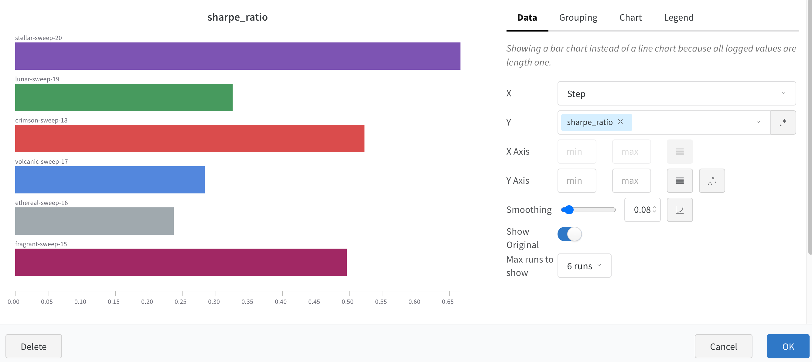
A bar plot presents categorical data with rectangular bars which can be plotted vertically or horizontally. Bar plots show up by default with `wandb.Run.log()` when all logged values are of length one.
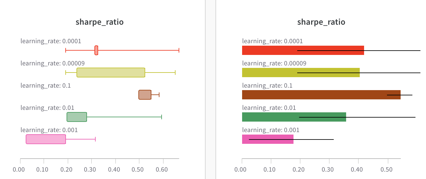 Customize with chart settings to limit max runs to show, group runs by any config and rename labels.
 ## Customize bar plots
You can also create **Box** or **Violin** Plots to combine many summary statistics into one chart type\*\*.\*\*
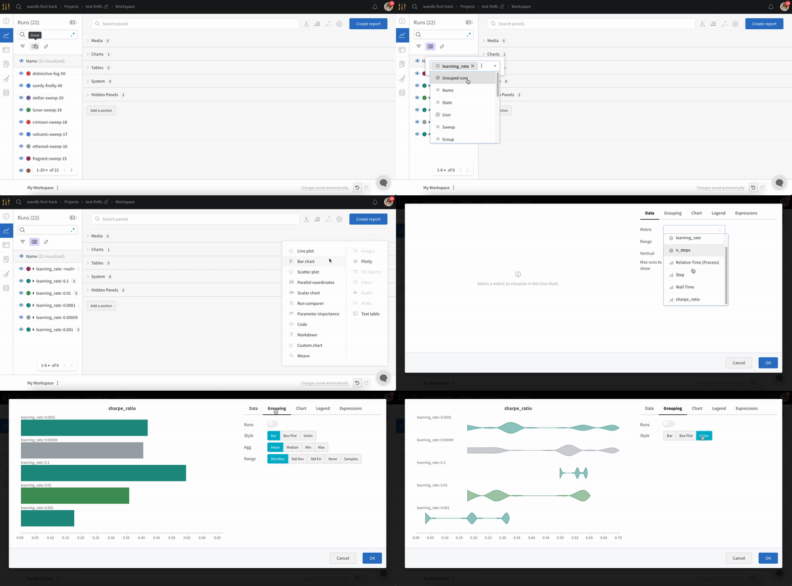
1. Group runs via runs table.
2. Click 'Add panel' in the workspace.
3. Add a standard 'Bar Chart' and select the metric to plot.
4. Under the 'Grouping' tab, pick 'box plot' or 'Violin', etc. to plot either of these styles.
## Customize bar plots
You can also create **Box** or **Violin** Plots to combine many summary statistics into one chart type\*\*.\*\*
1. Group runs via runs table.
2. Click 'Add panel' in the workspace.
3. Add a standard 'Bar Chart' and select the metric to plot.
4. Under the 'Grouping' tab, pick 'box plot' or 'Violin', etc. to plot either of these styles.